Whether you have a landing page that is not converting well or are thinking about creating one for your company, it is crucial that your business has an effective one. A landing page is a standalone page designed to generate qualified leads. A landing page is “the face of your brand.” The landing page can also drive sales, with an average conversion of 9.7%. One of the obstacles marketers face is generating traffic from the landing page. In fact, 61% of online marketers’ biggest challenge is generating traffic and leads.There are two main benefits associated with a high-converting landing page. The first benefit is that visitors want a seamless purchasing journey, so the landing page can offer an efficient process for the consumer. The second benefit is that the page can show visitors a promotion of an upcoming sale or product.While building a high-converting landing page is more of a science than an art, we have outlined the steps you can take to elevate your landing page.
Write an attention-grabbing headline

Writing a compelling headline on a landing page is the first step to capturing a visitor’s attention. Therefore, it is important to make sure it makes an impact and has staying power. Without a killer headline, the visitor is more inclined to pass the page or leave it quickly.The headline should tell the reader all about the product or service offered. It should be engaging to the reader, who will ultimately decide whether to continue on the page or leave it.Another good rule of thumb is to make the headline short but telling. There is no preferred word limit for a headline; however, you should use as few words as possible, as long as the reader has just enough to understand the topic.The final tip for creating an attention-grabbing headline is to make it crystal clear. Instead of dancing around your products or services, go straight to the point of what your company offers. Also, do not be vague in your messaging.
Include a subhead

Since we recommend using as few words as possible for your headline, the subhead should be longer than the headline but not too long. A standard to implement is having a subhead that is two or three times the length as the headline. For example, if your headline is seven words, your subhead should be about 15 words.Finally, you want to provide the reader with a purpose to continue reading. The subhead should be concise, crisp, and not over-explained. Remember, the goal of a subhead is to explain yourself. Therefore, the subhead should elaborate on the headline by providing complementary information.
Add photos and videos

The brain processes an image 60,000 times faster than text. While the difference in reaction is pretty minuscule, looking at photos is faster and can be more impactful. After all, a picture is worth a thousand words.The photos should be relevant to the products or services offered. If your company sells a physical product, the landing page should include a photo of the product. If your company offers a service, the image should demonstrate the services to the visitor. Finally, the pictures should be large, high-quality, and formatted for the web.Photos are often the first thing you see when you are on a landing page. As such, the photo or photos that are selected must make a great first impression. This important selection will encourage people to stay on the landing page longer.While photos are essential if you want to take your landing page to the next level, use video as well. Using video on your landing page is one approach you can take to drive conversions, and it can separate you from the pack. Including videos on your landing page can increase conversions by as much as 80%.
Include testimonials and reviews

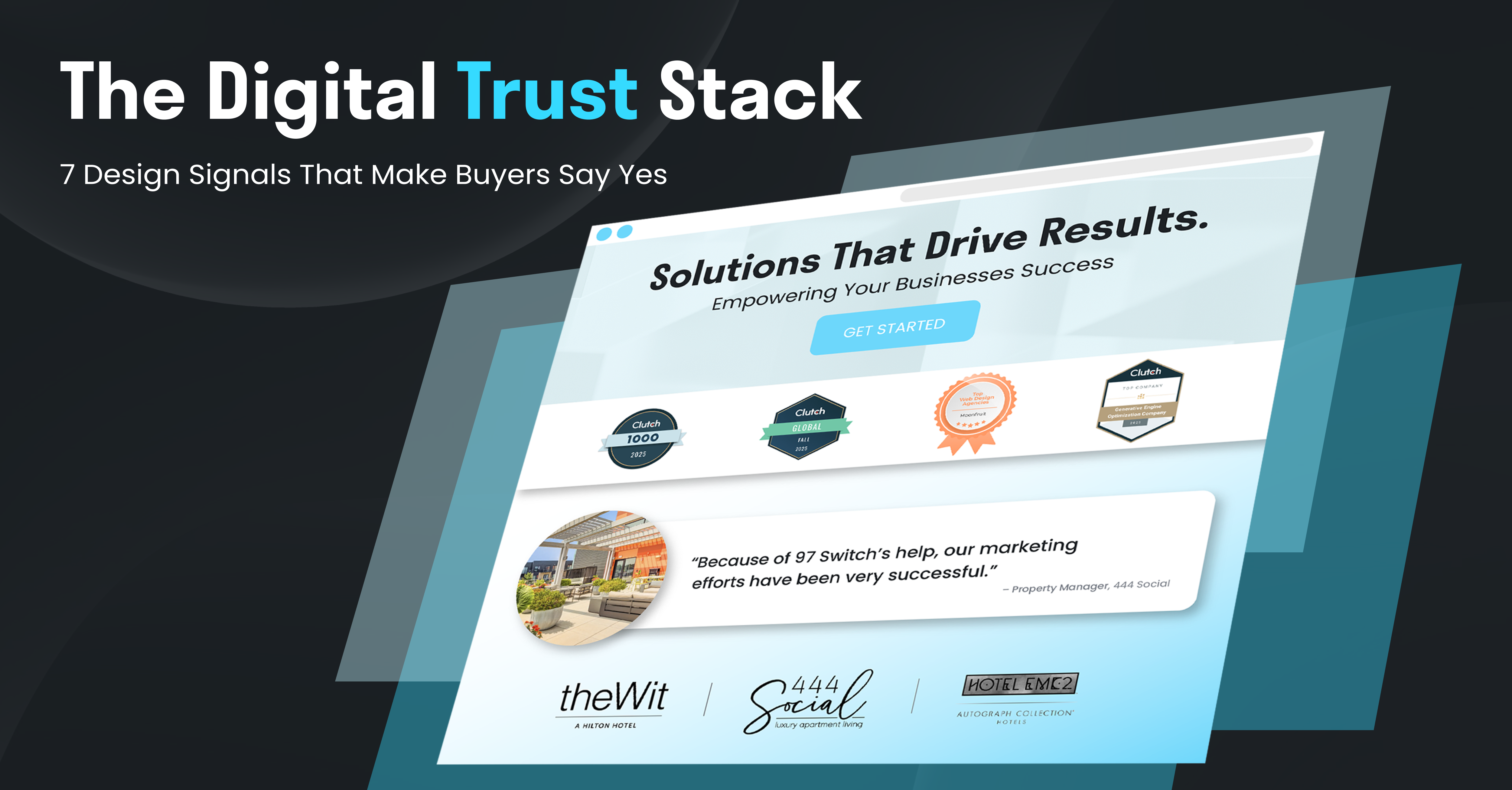
Adding extra information to your landing page beyond the headline and subhead is crucial. One tool you can utilize is to show the benefits of your product or service. An explanation of the benefits will hopefully convince the user to take action.One such method to explain the benefits is through a testimonial or two. Having positive feedback from previous customers impacts future purchasing power. 37% of the top landing pages include testimonials.Reviews are also good at conveying your benefits. While testimonials are a longer story of a customer’s experience, reviews are the condensed version. Another feature of reviews is the star rating attached to it. This is helpful for companies who want to visualize their customer’s experience.
Keep the design simple

While we have gone over the necessary materials for a landing page, an often forgotten element is the page design. You can nail the headline, subhead, photos, and information on your landing page, but if the design is subpar or does not match the message of the landing page, then you will have a hard time converting customers.The landing page is the face of your brand. Thus, it is critical to keep the design simple. Make sure the landing page presents a good flow from top to bottom and is void of distractions for the reader.It is also recommended that you use a variety of colors on your landing page. We recommend using your company’s colors as the main accents for your landing page. For secondary colors, we suggest lighter shades.A way for your landing page and company to stand out from its competitors is to design the page for mobile devices first and then desktop afterward. A majority of web traffic is on mobile devices - the chances are you are reading this post on a mobile device.Finally, make sure that your page is designed to load quickly. A one-second delay in loading speed leads to a 7% drop in conversions. When the user opens up the landing page, all of the material should be present. A quicker loading speed will allow the visitor to have an enjoyable experience.
Add a clear call to action

The final step in creating a landing page is a call to action feature. The call to action allows the visitor to take the next step in their journey. We recommend adding multiple call-to-actions throughout the landing page. One call to action can be placed at the top, in the middle, and then one at the bottom.The call to action should also stand out from the rest of the text. Adding a different font, shape, or color to the call to action will allow the button to be distinctive. By not having a call to action on the landing page you risk a chance for a conversation or transaction from occurring.
Key takeaways

You now know the ins and outs of what makes up an effective landing page. With a killer headline, subhead, and photos or videos, your page will almost look perfect. To complete your ideal landing page, do not forget about including additional information, a simple design, and a call to action.The landing page is the face of your brand. As such, it is paramount that it is kept clean and up-to-date at all times. These six steps we recommend can generate more leads and lead to higher conversions for your business.
Interested in learning more? Click here or reach out to info@97switch.com.


