Research shows that people can make a judgment of your website in 50 milliseconds. With numbers like that, it’s growing more and more essential to have a website that is easy to use and gives a good first impression of your brand. That’s why we like to say that your website is your 24/7 brand ambassador. With that in mind, here are 8 things every website should have.
Strong branding

Your branding is the first thing people use to recognize your business from competitors. Your website should immediately communicate to your visitors who you are and what they can expect from you. If your website is poorly designed, and looks more like a word document, this not only looks extremely unprofessional, it also confuses your audience. They will be looking for your branding, and if they can’t easily discern it, they’ll move on to the next search result (most likely a competitor).
Easy, helpful navigation

It can be extremely frustrating for your audience to search in vain for specific information on your website. It’s vital to have a menu that will take them to each important webpage within your site. If they can’t find what they’re looking for in three clicks or less, they will become frustrated and it will leave a bad impression on your brand. When in doubt, hamburger menus are usually a good option for navigation.
Clear offering

This is one of the most important elements to include on your website. Your audience needs to be certain of what you are selling them. More than that, you need to sell the transformation that your service or product will bring them. A good practice is to show rather than tell what you do. This can be done through listing your offers with photos and storytelling.
About Page

An about page is a great way for your audience to get to know you better. This can include the business’ story, mission, values, or goals. This information can help you build credibility and create a loyal audience who feel that they are a part of your story. This can also help your business stand out from the noise, as it gives your business more personality.
Testimonials

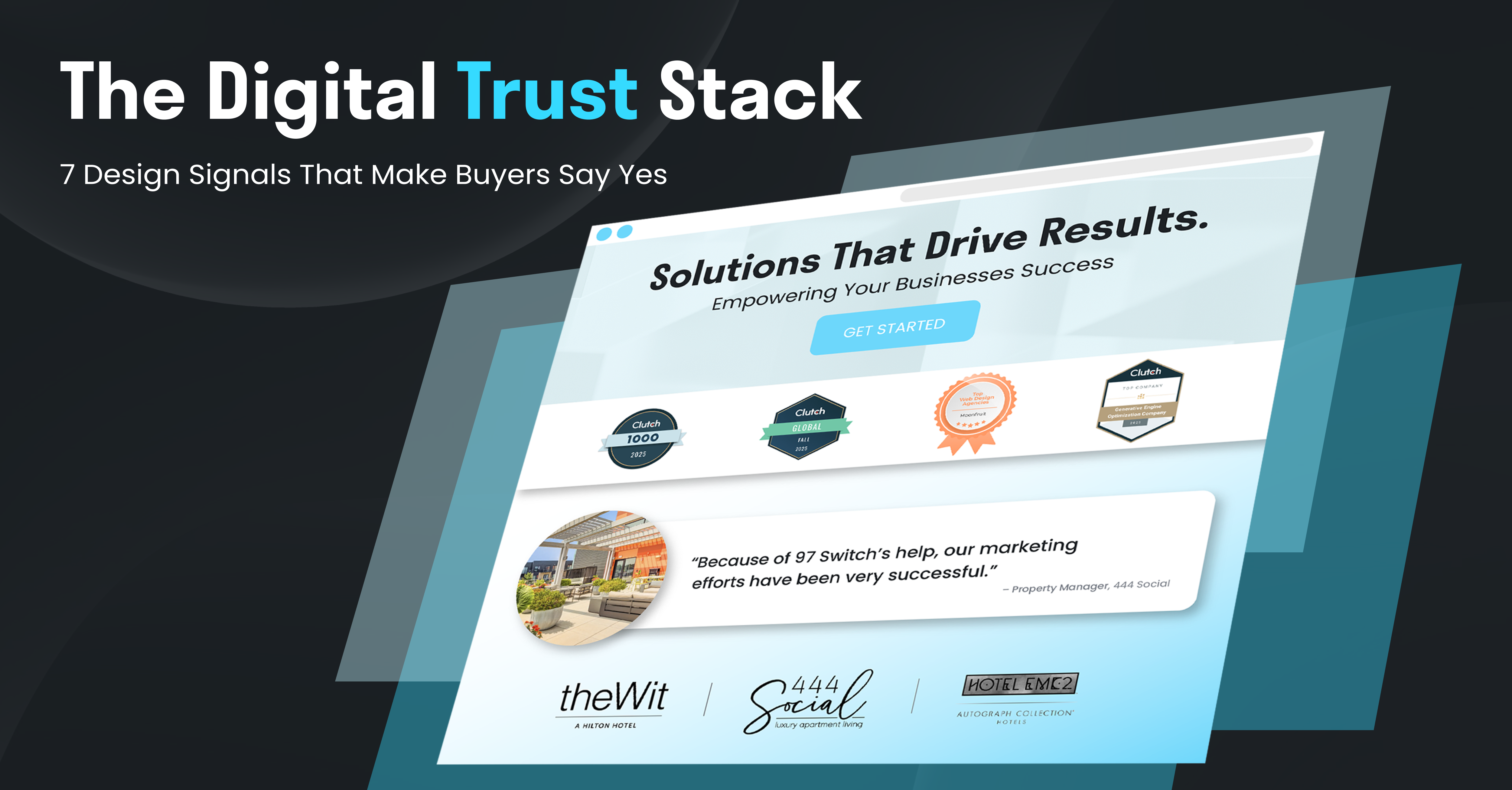
Displaying your positive reviews or testimonials is essential to building credibility. When people visit your website, they need to know what sets you apart and why they should choose you over a competitor. These testimonials should be prevalent on your website and display what makes all of your services or products great. This is a far better way to sell than just having customers take your word for it. It can help them know what to expect if they choose to work with you, which is essential to the purchasing decision.
Contact information

Customer support is important in every business. Your website should show that you care and want to help in any way you can. In order to allow your audience to reach you, it’s imperative that you include contact information such as a phone number, email, address, or even a form to fill out. This will make you accessible and show your audience that you are there for them.
Call to actions

If you are not utilizing call to actions, your audience won’t know what you want from them. As obvious as it might sound, literally telling them to buy from you, email you, or check out your services or products is important to gaining conversions. There are techniques to make this more effective, such as creating scarcity and urgency, but as long as a call to action is in place, you’re off to a good start.
Mobile capabilities

Today, 53.74% of web visits are mobile. That means that it’s more vital than ever to have a mobile first website and strategy. Your site needs to be easy to navigate and read from any screen size, whether that be desktop, mobile, or from a tablet. This means selecting a large enough font, allowing your images to resize properly, and ensuring that the buttons work properly. There is much more that goes into a mobile site, but these are just a few elements to consider.
Consider a website audit

There is so much to consider when designing and developing a website for your business. Every year or so, it’s a good idea to conduct a website audit to continue to make improvements. If your website is currently missing any of these elements, it might be time to consider a website audit.
Interested in learning more? Click here, or reach out to info@97switch.com.


